In 2024, Sno-Isle Libraries asked us to build on the beginnings of a branding project that got backburnered due to the COVID-19 pandemic.
The goal: Expand the brand through a unified story and visual system, and empower their team with tools to create greater consistency across all touchpoints.
Sno-Isle Libraries’ marketing team is tasked with ensuring consistency across 23 community libraries. The challenge wasn’t just to create a brand, but to build a practical system that balanced consistency with flexibility. At the same time, the brand had to resonate with a wide range of audiences and contexts—from urban and rural communities to teens and seniors, from playful social content to serious topics like legal resources or end-of-life planning.
We set out to create a tagline, logo system, and brand voice that was flexible enough to adapt to each use case, while presenting cohesively and consistently across physical and digital spaces. We then helped develop the new brand story and identity across those touchpoints.
To create that cohesion, we began by identifying core truths the organization holds and using them as the foundation for everything that followed—building a brand from the inside out. Taking the Sno-Isle Libraries team through our Belief Session process, we uncovered a simple, powerful belief: “libraries exist for everyone.”
Then, working with Sno-Isle Libraries to define that belief, we explored the concept of “possibility”: the idea that the library isn’t just books and services, but a place that makes discovery possible for all.
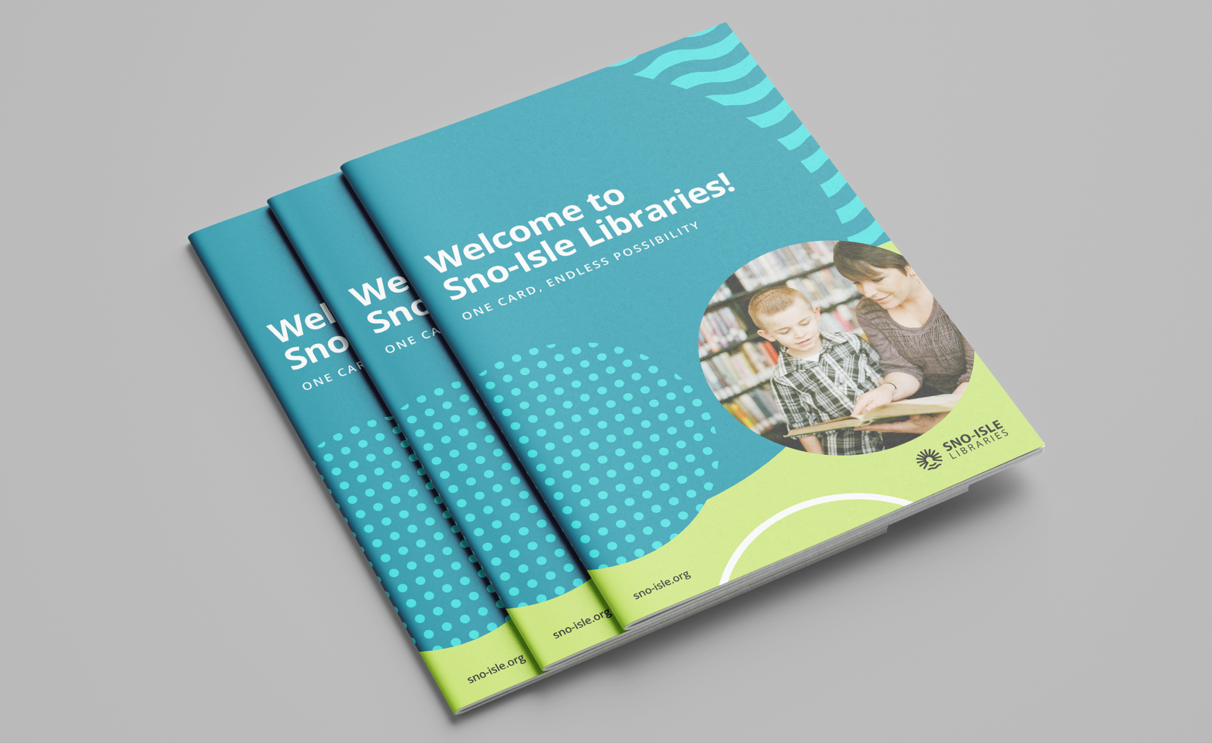
We developed “Check out possibility” as a tagline, a playful nod to the library experience that underscores the breadth of opportunities Sno-Isle Libraries makes available to everyone.
Building on a wave element the Sno-Isle Libraries team had been using, we created a logo icon that represents the geography connecting the Library District’s two unique counties: mountain rivers that flow to coastal waters, and the sun that connects east and west. The sun’s rays evoke an open book and endlessly expanding possibilities.
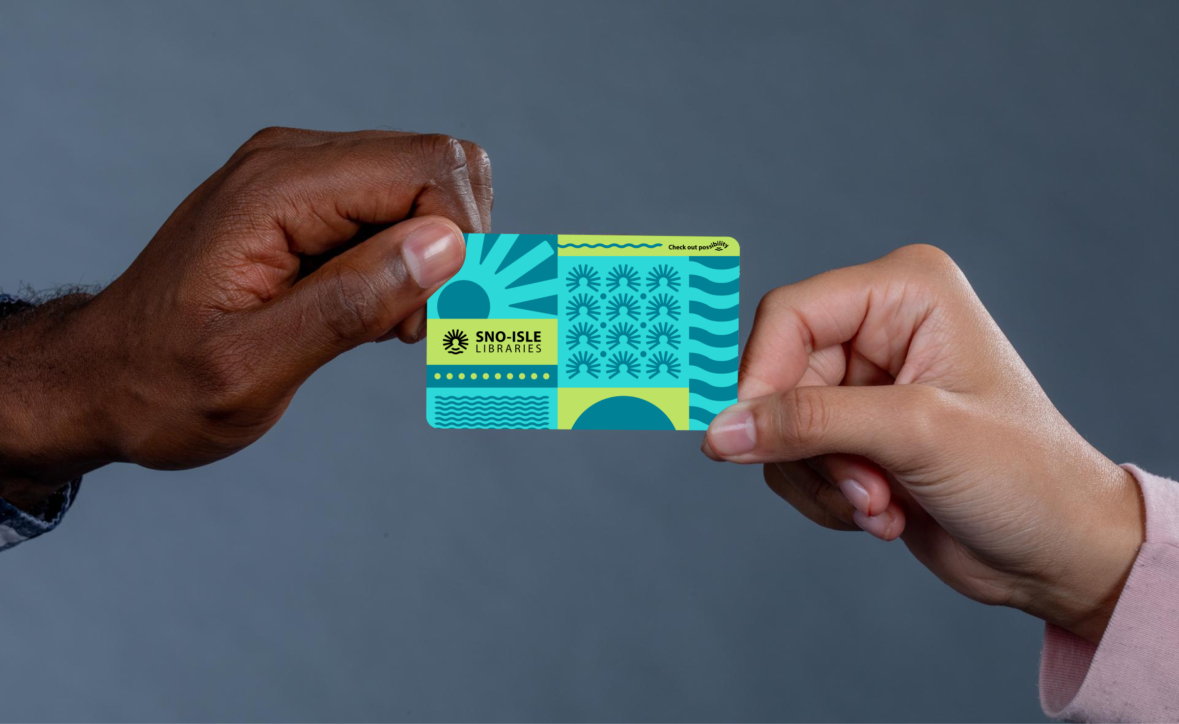
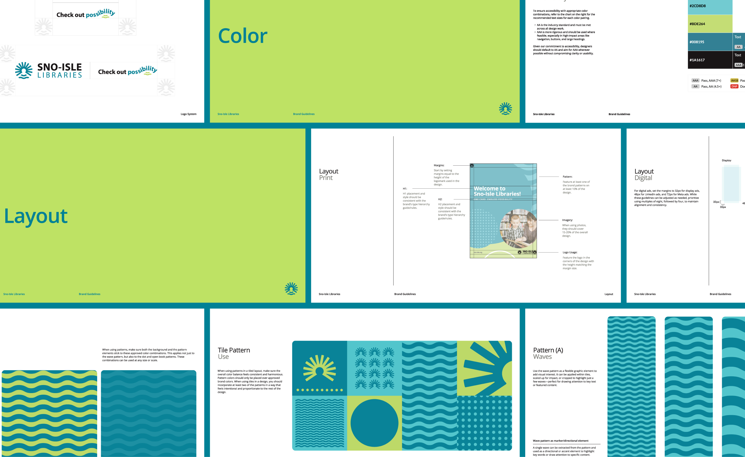
To develop a system that could be used flexibly without sacrificing visual consistency, we created a diverse pattern library, including a modular “patchwork” variation that allows for endless combinations of modular square elements.
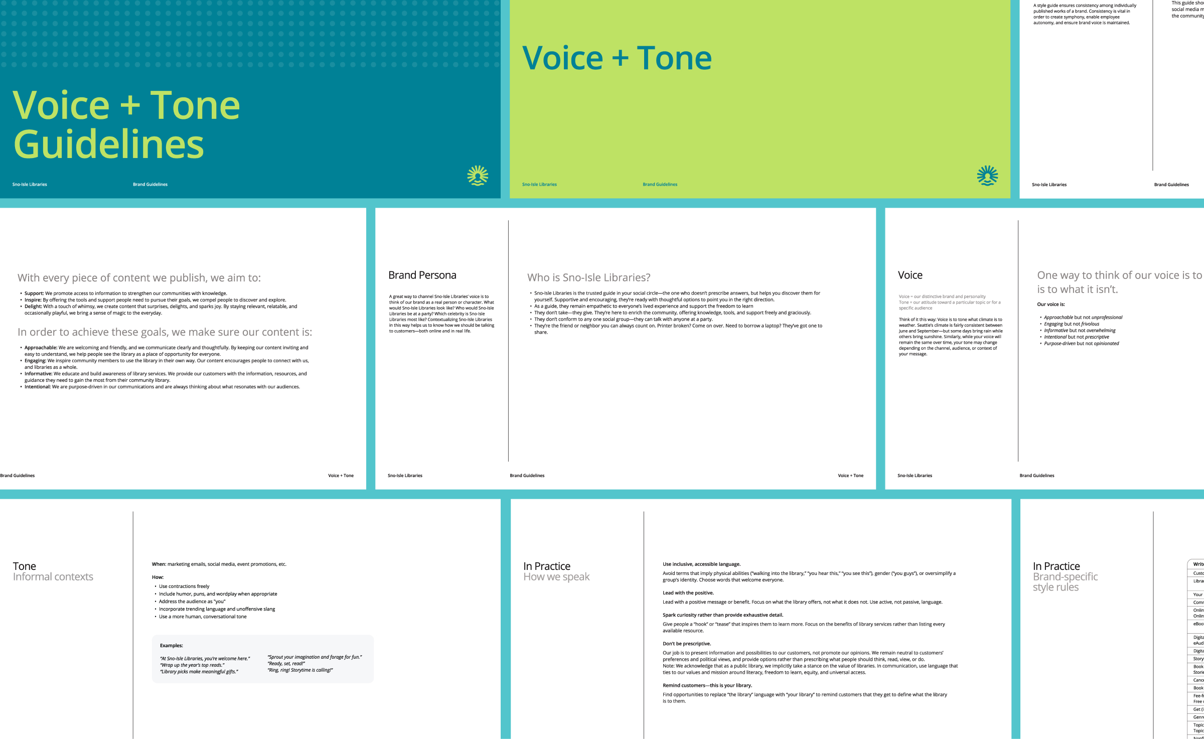
Voice and tone guidelines translated Sno-Isle Libraries’ belief into everyday communication—balancing clarity and professionalism with warmth, inclusivity, and moments of delight across all channels.
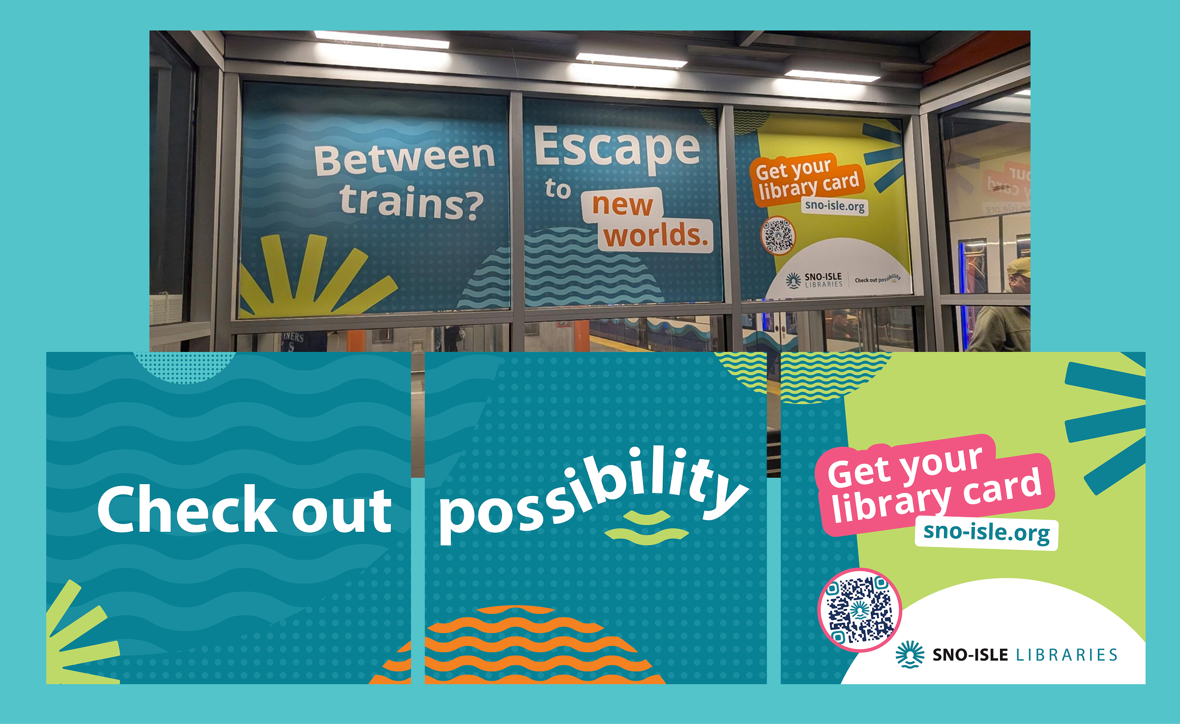
In 2025, Sno-Isle Libraries implemented their expanded brand across all owned properties. To support this rollout, we created an omnichannel regional campaign that transformed the local transit experience through station domination ads, full-train interior takeovers, and streaming commercials supported by local broadcast placements.